PANTONE'S COLOR OF THE YEAR MAGAZINE
Data Visualization & Publication Design, 2023.
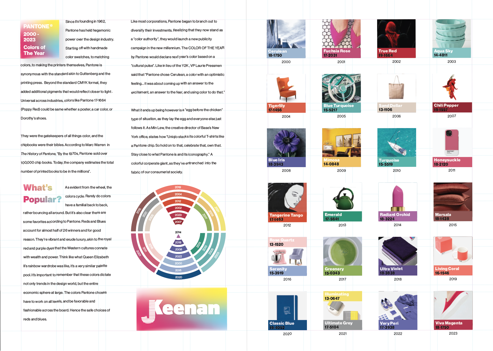
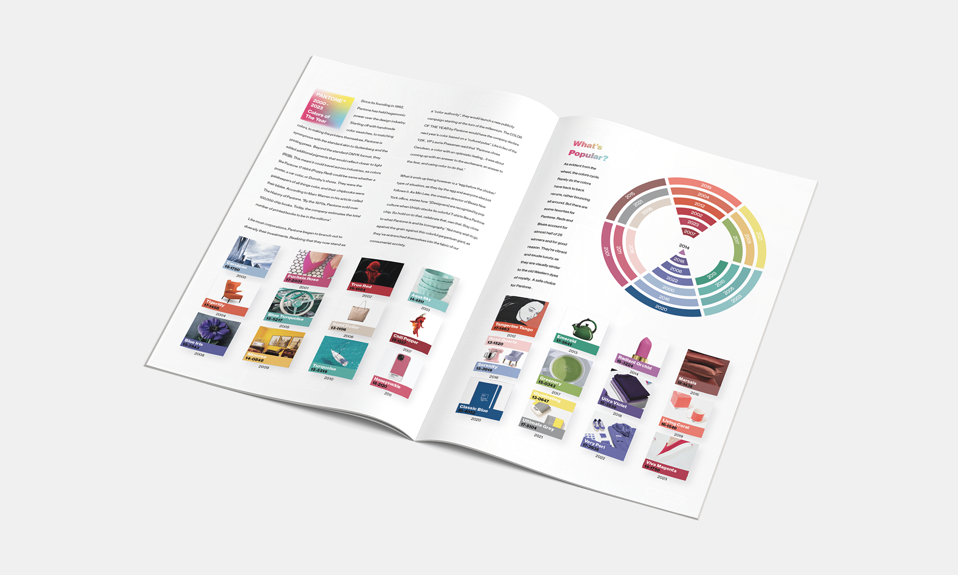
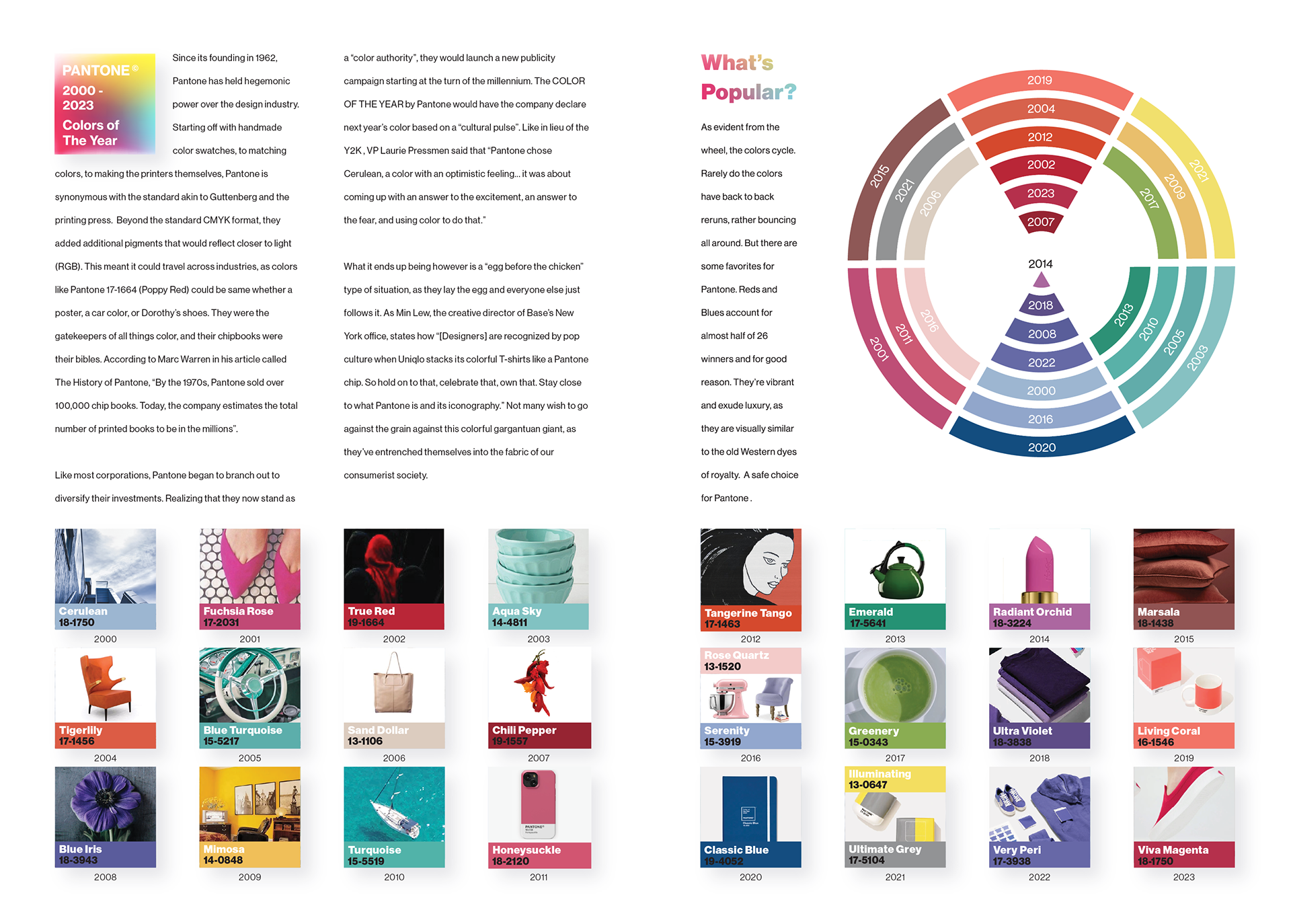
Tasked with creating a timeline data visualization for a magazine, I choose to analyze the last 26 winners of "Pantone's Color of the Year". Playful and professional, I used wide gutters and grid systems to make the information as disgustable as possible. But the pops of color and products add intrigue and enforces the notion that the awards are fundamentally rooted in consumerism. Not to mention how it incorporates the entire dataset in a fun and engaging way.
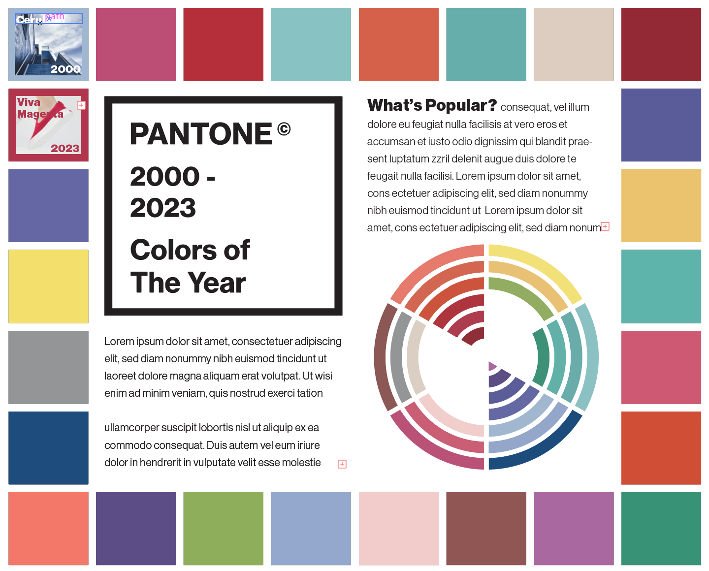
The design of the wheel similarly rifts off modern design sensibilities. Sorted by color's families, it looks as aesthetically pleasing as it is informative. The reds and blurples form a point in the middle, that these luxurious timeless colors dominate amongst the victors. Hence how they make a "hourglass" shape.
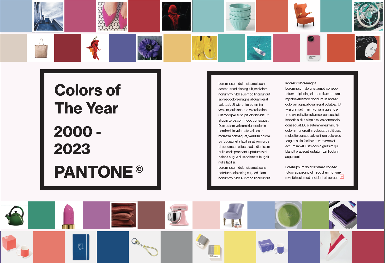
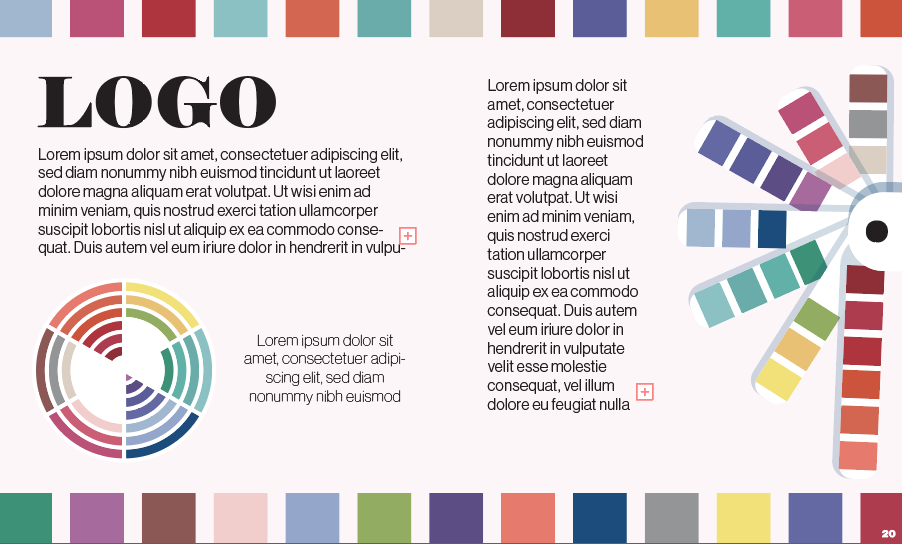
The entirety of the piece takes notes from the visual language of Pantone. Helvetica, grid systems, and sophistication. But I expanded this identity by adding a gradient mesh into the logo and h1 text, a style at the cutting edge at the moment, in order to give a modern and deliberate hierarchical heft to them. Afterall, who's at the bleeding edge more than Pantone in the design world?
EXPLORATIONS INTO DIFFERENT COMPOSITIONS
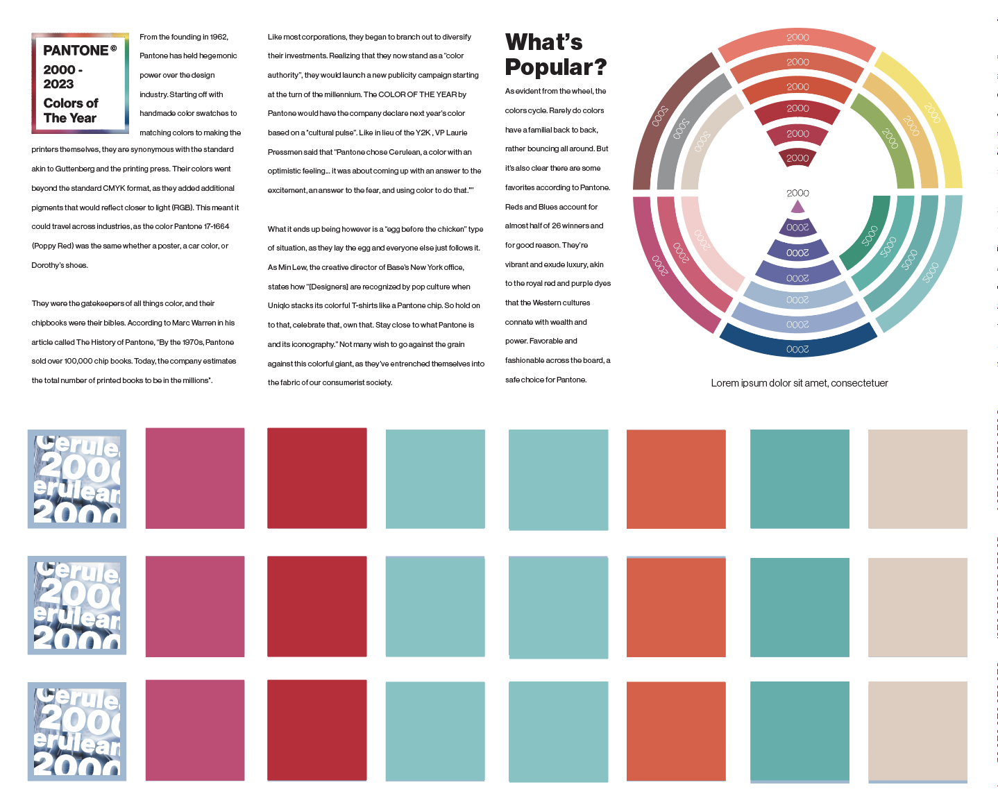
Exploration 1
Exploration 2
Exploration 3
Exploration 4
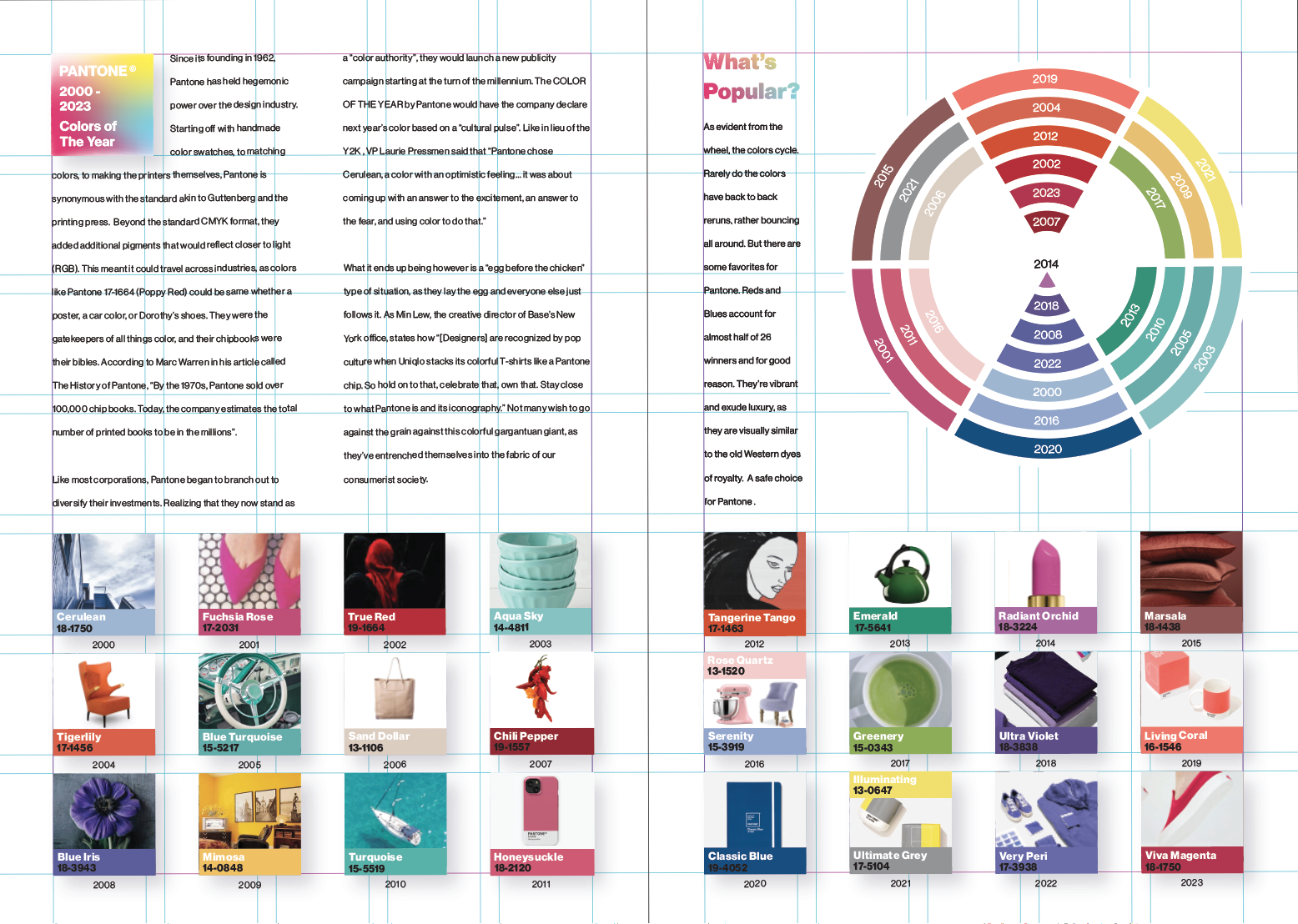
Grid