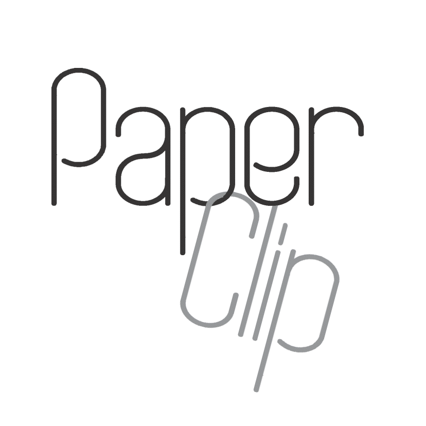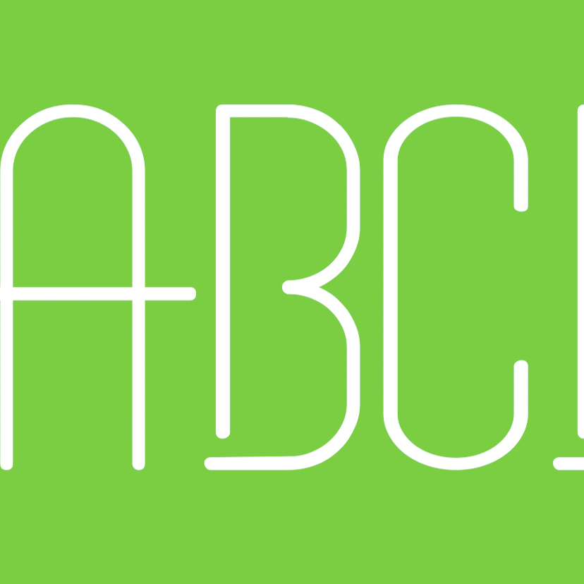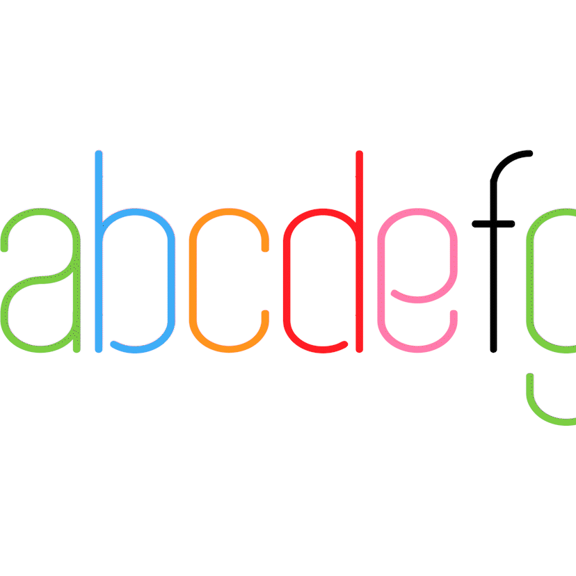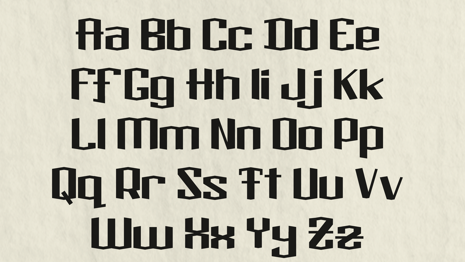
PAPER CLIP TYPEFACE
Font Design, 2024.
Simple and stylish, Paper Clip as a typeface simultaneously shifts between a quotidian textual but a quintessential display quality. The seamless line thickness mirrors the staple design philosophy of ultra thin san serifs, matching its soft corners and rounded edges to create an easy-on-the-eyes feel. The simple construction adds to this sensation, mimicking handwriting as if it was written in pen for a meeting. But it distinguishes itself with having noticeable openings, such as in the capital Q or lower case e, sharing a likeness to the standout font Stencil as seen in the Home Depot wordmark. These intentional gaps in conjunction with the aforementioned rounded curves creates a recognizable visual similarity to paper clips in which it is named after. The synthetization of these two philosophies results in the typographical embodiment of business casual, perfect for powerpoint presentation!
Made in FontLab 8.